
Tinkering with black boxes and the need for a critical mindset
From 20 to 24 February, a winter school on “Skills in digital humanities” was organised at the University of Luxembourg, where the participants were introduced to the software Nodegoat and the development of databases. It was a possibility of tinkering with a digital tool that was completely new to me. In the following, I will give a personal account of my own experiences with Nodegoat, and present a critical reflection on the problems I encountered and the use of digital tools.
Thinking in data models
On the first day of the workshop, the participants were introduced to developing data models, necessary to create meaningful databases in Nodegoat and thus the foundation of what followed. The data model is composed of two main elements: types and classifications. Types contain objects. For example, the University of Luxembourg would be an object of the type ‘institution’. A further distinction needs to be made between an object description (OD) and a sub-object (SO). Whereas the former defines the stable identity of an object, the latter changes and is not fixed. Usually, names and gender tend to be object descriptions, and occupations or places of residence are sub-objects. Unique events, such as date of birth, are sub-objects, too. Under the menu ‘Design’, though, Nodegoat leaves it up to the user to define what she/he wants to set as OD and SO. Even though basic rules need to be respected, the data model can be adapted to the specificities of the data.
The second aspect in data models are classifications, composed of labels, and used to describe objects. Gender, for example, would be a classification and composed of the labels male and female. However, the user has the freedom to add as many labels (and classifications) as she/he needs. These flexibilities are extremely important, as the same data model cannot be applied to all sources, and the research question informs the way databases are built. Yet, data models are not only about defining types and classifications. These ‘building blocks’ need to be linked together for data visualisations to work. In other terms, if we want to show the social relations of a person in a graph, we need to tell Nodegoat that this person is related to other people.
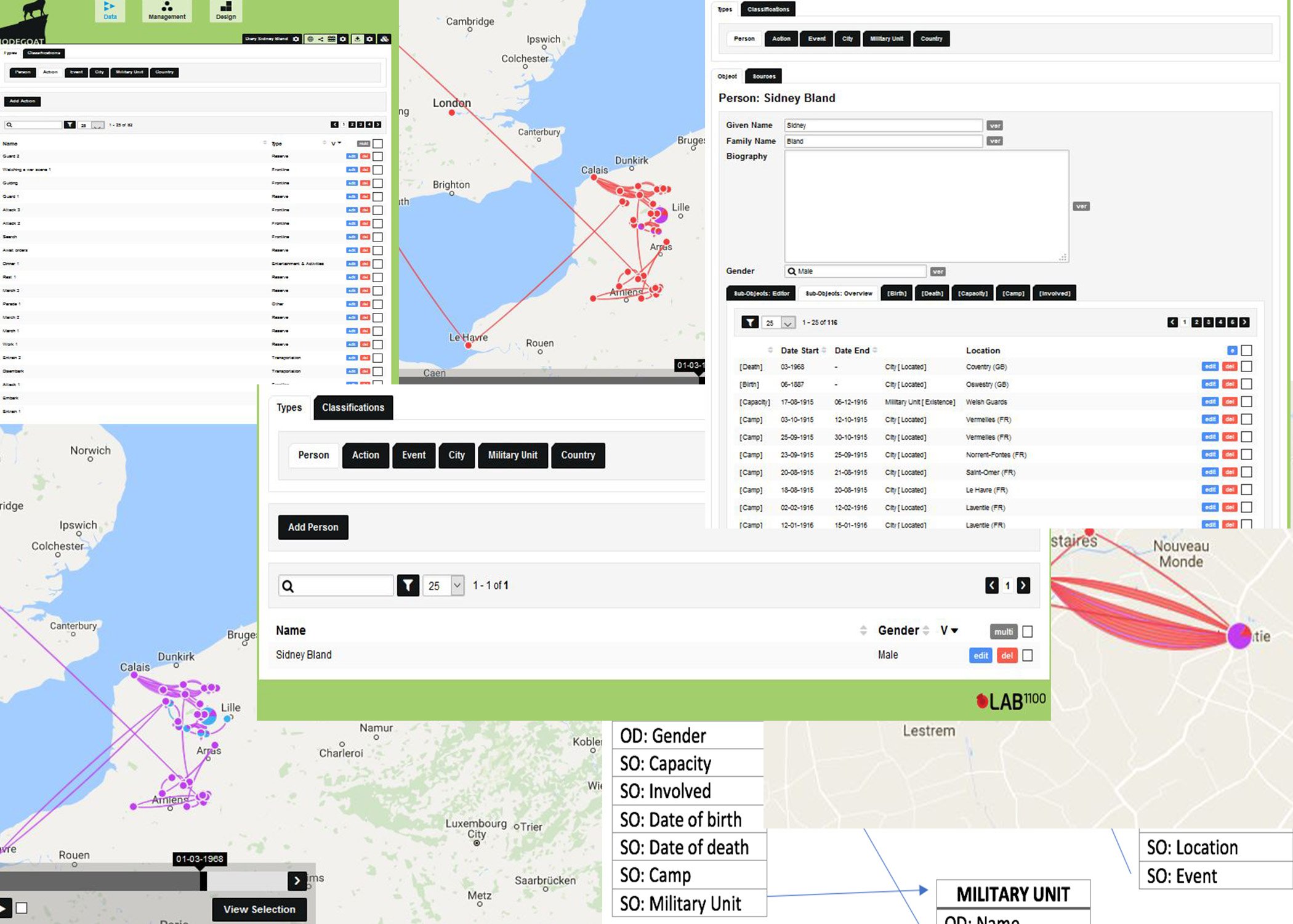
In the beginning, the idea of data models sounded very abstract to me and I needed time to grasp the logic behind it. During the winter school, I developed my data model and database in Nodegoat based on the diary of British WWI soldier Sidney Bland, who served in the Welsh Guards. His entries begin in August 1915 and end in December 1916. However, Nodegoat was not programmed primarily with such types of sources in mind, especially if it’s only one, and this led to many difficulties. In my case, I wanted not only to show Bland’s journey on a map, but also intended to visualise the different kinds of events and actions described in the diary. I wanted to find out whether I would get new insights thanks to data visualisation.
A data model for a diary

In my data model, I distinguished between the types ‘Person’, ‘Event’, ‘Action’ and ‘Military Unit’, besides ‘City’ and ‘Country’ (cf. figure 1). I considered an event as a general manifestation on which Bland had no direct influence. An action, in contrast, was explicitly carried out by him. This distinction did not exclude the possibility of relating an action to an event, when, for instance, Sidney Bland attacked an enemy position (action) during a battle (event). The military unit (Welsh Guards) turned out to be of little relevance for the results. It even caused me some trouble, as I defined Great Britain as the ‘location’ of the Welsh Guards (after all, I thought, they are part of the British army). Yet, Nodegoat interpreted it as the ‘workplace’ of Bland and provoked a visual mess (cf. figure 2).

As for the classifications, I defined three: type (to classify the events and actions according to their nature, such as ‘war’ or ‘entertainment & activities’), gender and capacity. Naming a classification ‘type’ was, indeed, not the wisest choice, but I will stick to the names I used during my experiment, for the sake of self-criticism. In general, my data model would look as shown in figure 3 (the types ‘city’ and ‘country’ are left out). The arrows show how the types refer to each other. The SO ‘Camp’ refers to a period as well as a location.

Of missing links and mysterious workarounds
I created my database in Nodegoat in two phases. First, I entered the different places Bland has been to, as well as the duration of his stays. This task turned out to be much more complicated than I thought. Though the soldier often indicates the names of villages, some of their names are not written correctly. One example is “Lingue” or “Ling”, which cannot be found with either spelling (neither on GeoNames nor on Google Maps). In these cases, I only indicated the stops before and after “Lingue”, i.e. Ames and Norrent-Fontes, leaving out one station for creating a coherent representation of the journey on the map. In other cases, guesswork and logical deduction were necessary, because of wrong spelling or an abbreviation of the name. Instead of Le Havre, Bland writes “La Harve”, and “Bray” probably refers to Bray-sur-Somme, the most logical choice, though other villages in France begin with Bray, too. Between the 25th and 26th September 1915, Bland writes that he and other soldiers “sleep in open tonight”, and again during the following night. Where this “open” is exactly, remains unknown, as they previously left the town of Ames and had been marching for many hours. Here again, I had to leave this stop out of my database for lack of precise indication. Another issue to keep in mind is that he was not necessarily in a town itself, but in a camp several miles away. Furthermore, he makes a distinction between being in reserve and going to the frontline. For the sake of visual representation, and because I did not possess more information on the exact location, I had to assume that in both cases, he was roughly in the same area. There were, then, many compromises I had to make, and which were in my opinion very questionable. Is the visualisation even reliable when stops are left out and approximate locations are indicated so many times? One could say that these compromises make no greater impact when considerable amounts of data are used for visualisation, and that even the approximated geographical references are enough to view, for instance, the shift of a frontline (thanks to a timeline at the bottom of the map).
Nevertheless, when it comes to the details, the graphical representation and the database are not reliable. In addition, the visualisation itself was flawed (cf. figure 4). Nodegoat did not draw a line between London and Southampton, nor from Arques to Norrent-Fontes, which are only the most striking examples. Between Bray-sur-Somme and Coventry (place of death), however, it creates a connection, thus suggesting that he travelled from Bray-sur-Somme (last stop mentioned in the diary) to Coventry, which is misleading, as several decades lie in between: He died in Coventry in 1968, according to the metadata on Europeana. Though this issue can be remedied by just removing the information on Bland’s place of death, the missing links between his stops are much more problematic. This happens each time our soldier leaves a town on the same day of his arrival, and for some reason Nodegoat misinterprets it. At the time, I could solve this by unchecking, in the map filter, the ‘capacity’ box, but even with the explanations I was provided with, I still could not understand why this solution helped – and why such a problem should arise in the first place.

In the meantime, however, the database has become more complex and the fix is not working anymore. I can only guess the reason for this: Is it because of the SO ‘Involved’ added afterwards, referring to the actions Sidney Bland carried out? Yet, by unchecking the ‘Involved’ box in the filter, London and Southampton are still unconnected. Even more puzzling is the fact that Oswestry, Bland’s place of birth (the dark blue dot in the northwest of Birmingham), is now linked as well to London as to Southampton (cf. figure 5). I do not really understand why, and I would need to uncheck ‘birth’ in the filter for avoiding this.

Colour-blind software and unnecessary work
After entering all the stops of Sidney Bland’s journey in my database, I focused on the events and actions he described. Under the type ‘event’, I listed everything that happened without Bland’s intervention, such as an artillery bombardment. Concerning the location of these events, I had to make some compromises, again. In his diary, Bland might describe the sound of artillery bombardments, but they can be heard over a long distance. Nevertheless, I used Sidney’s location as a reference every time a precise indication was missing. The classification ‘type’ was added for categorizing events (as well as actions). The resulting map looked quite unspectacular and did not help me in getting new insights (cf. figure 6). The bigger the dots, the more events happened in a location; most of them occurred in Poperinge in Belgium (six bombardments and one military concert in a period of several months), but I would also be able to draw this conclusion by looking at an old-fashioned excel table.

However, I was faced with another problem: I could not assign colours to labels and I was not able to find such an option. It would have been much more useful to visualise the difference between ‘war’ events and mere ‘entertainment & activities’ events, or a ‘frontline’ and a ‘reserve’ action. To put it more bluntly, I would have liked to see the difference between shooting and eating pudding. This was, however, not the only issue I was confronted with. The actions were all linked to Sidney Bland and, initially, also to a location. As labels, I reused two of those I defined for events (‘Entertainment & activities’ and ‘Other’) and added ‘Reserve’ and ‘Frontline’ (to distinguish whether Bland was in the trenches or not), as well as ‘Transportation’ (for actions such as embarking).
With actions added to Bland’s movements, new lines appeared, for instance, between Southampton and Le Havre, which were not supposed to be there (cf. figure 7). At the same time, places such as Southampton and London were now finally connected. At first, the additional lines puzzled me, as somehow the software interpreted the new information as travels from one action to the next, in addition to the movements between camps. Only later did I understand that indicating the location of actions was redundant, as it had logically to be the same than the location of the person who carried those actions out. Thus, by removing the geographical references, I solved the problem, even though between places such as London and Southampton, there were again no connections any more (cf. figure 8).


Another issue that I had to face concerned the absence of the events, as I was not able to visualise different layers on a same map, i.e. events, actions and movements simultaneously. They could only be shown separately. Indeed, part of the work I did turned out to be useless, mainly because I lacked knowledge of Nodegoat’s capabilities.
The lessons to be learned: reflections on the use of digital tools
After all this work, the question I had to ask myself was whether Nodegoat could provide me with new insights on Bland’s activities between August 1915 and December 1916. The short answer is no. Though the map allows an appealing (albeit problematic) visual overview of Bland’s journey, I did not gain new information. The number of lines between two places showed how many times he travelled back and forth, but I would also learn this by analysing excel tables. Furthermore, how many lines might be lacking just because of the problems I have encountered? Indeed, Nodegoat is not designed for using one single diary, but for bringing together large amounts of data with a specific research question in mind. The sources, however, need to be reliable and precise. In my case, I had to make too much compromises for the sake of simplification and better visualization. As the one responsible for creating the database, I knew which workarounds I used and what had to be left out, but what about the public? What about those people who look at the visualisation and believe the information to be reliable and accurate? How would they interpret the missing links and the redundant lines?
The aim of my account was not to give useful instructions on working with diaries or offer a manual for using Nodegoat, but the main purpose consisted in illustrating that the use of digital tools needs to be critically engaged. Mistakes are part of the process. Digital humanities are as much a great opportunity for new approaches as an art of failure and critical reflection. Nodegoat draws its strength from the quantitative analysis. The results of my analysis would certainly be more meaningful if I had used more diaries and added more data. In addition, I had no previous knowledge of the program, and therefore fostered wrong expectations towards its possibilities, resulting in a loss of time for ideas that would not work. The efforts I invested in creating a database of Sydney Bland’s actions with the aim to visualise on the map the different types were in vain for the purpose I had in mind.
However, these failures and issues have taught me many important lessons on a methodological level. Digital tools such as Nodegoat have their limits. It is possible to see the intensity of a phenomenon, but not necessarily the exact nature of it. On the map, it looked like Bland was staying in the same town until he left, but no distinction is made between frontline and staying in reserve, except for the labels I used which were not visualised. Bland understandably did not indicate precise coordinates of the trench he was holed up in; and why should he even specify it in a diary? In addition, the map I created showed that between some stops, Bland travelled more than between others, but by what means, in what conditions and for how long remain unknown.
Thus, when it comes to using digital tools, it is important to reflect on the type of sources used. A program is only as good as the data – and the user. The engagement with digital tools requires critical reflections on their purpose. What do we want to analyse? Can such tools help us in better understanding a phenomenon? Are our sources appropriate? Is our data precise enough? Should we even use a program for the sake of visualisation when so many compromises need to be made? With all the approximations and workarounds, I was not doing the work of a historian. In fact, I bended my data so it could fit the program’s capabilities. A tool, however, has to be adapted to our needs, not the other way around. If not, the same will happen as in my case: missing links, wrong visualisations and a certain degree of frustration. In this case, it would be better to abandon it, and look for an alternative.
My experience with Nodegoat illustrates the confrontation with a black box. I do not know the software code, and thus cannot fully grasp the data processing, especially when its results turn out to be different from my expectations, or simply wrong. I use its interface and enter data, and the results are shown in beautiful graphs or erroneous representations. But what happened in between? Solving problems such as missing links or needless connections requires knowledge of the ‘inner life’ of the program, a basic understanding of its possibilities and limits. Yet, choosing the right tool would also avoid having these problems in the first place. This is where digital humanities are so important: their aim is not only to show how useful digital tools can be, but also to provoke critical reflections on why things can go wrong and what really happens behind the interface. In our world, we take technology for granted, seldom think about its implications and rarely engage with its functioning. I encountered many problems when working with Nodegoat, but they helped in revising my own naiveté and taking a more critical stance towards digital tools. I certainly do not want to claim that digital tools are useless. On the contrary, but they only unfold their full potential when we really know how to work with them, and when to use them. As Mervin Kranzberg once wrote, “technology is neither good, nor bad; nor is it neutral”. To which I would add that we only need a critical mindset.